Nostalgia has been a major part of game design for many years. Developers have always used games history as a template for their creations, but with the indie game boom, helped along with programs like Xbox Live Arcade, Steam, and Nindies, people who play games have continuously flocked to indies for a taste of gaming’s early days. Look no further than Shovel Knight, which set out to create an early Nintendo-era style game from the outset and capitalized on that craving for the past. But Shovel Knight did something different. Shovel Knight used the NES era for inspiration, but also added some extras. They bumped up the quality of the imagery and music. They finely tuned the gameplay to match modern standards. And they did it just enough to create a strange effect. Playing Shovel Knight, you’ll feel like you’re playing a game right out of the 1980s, because we tend to look at our past through rose tinted glasses. Put the gameplay of Shovel Knight side by side with Mega Man, or Castlevania, or any of its other inspirations, and you’ll quickly see how nostalgia can betray you.
Mega Man (top left) and Castlevania (bottom left) for the NES compared to Shovel Knight. You can see how Shovel Knight has a much higher graphic fidelity. There’s a great video by Mark Brown that explores this more.
But sometimes, a game can feel nostalgic even if it has a completely new gameplay concept. Enter Splatoon, Nintendo’s neon-colored squid kid ink-shooter with attitude. Splatoon feels nostalgic, too. But that nostalgia doesn’t come out of the gameplay; rather it comes out of some specific visual and graphic design choices. And as we’ll see, modernizing nostalgic aesthetics without altering gameplay can play the same kinds of tricks on your mind as the all encompassing nostalgia bait that is Shovel Knight.
Splatoon 2 Single Player
The first time I played Splatoon, it struck me with an unexpected familiarity. I had never played anything like it, yet it felt like it had splatted straight out of my childhood. The matching neon colors, the texture of the ink, the funky 90s-esque clothing style, and the rebellious attitudes of the squid kids made me feel 10 years-old again. Then it hit me: if Splatoon had been conceptualized as a live-action television show, Nickelodeon would have made it in 1996.
Nickelodeon represents the pinnacle of children’s entertainment in the 1990s. Between Nick Toons like Ren and Stimpy, Rugrats, and Rocko’s Modern life; and Nickelodeon game shows like Guts, Legends of the Hidden Temple, and Double Dare, Nickelodeon wasted more of my time as a kid than anything else. One of the main staples of their entertainment philosophy was gross-out humor, which bred a snarky attitude that felt at home in the decade. Double Dare especially had a reputation for making the largest mess possible. The more the mess, the more fun – and sass – everyone had.
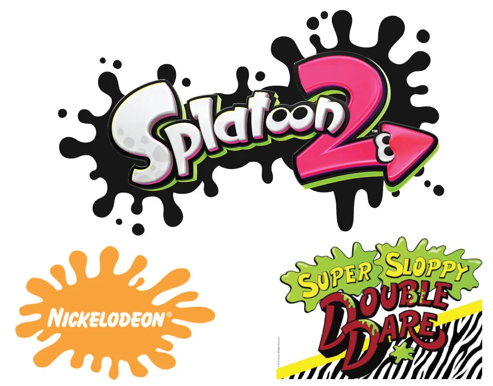
And so, this cocky, gross-out aesthetic started to bleed into Nickelodeon’s visual identity. The most recognizable version of the Nickelodeon logo from that time period featured the name of the channel in a white chalkboard font hovering in the center of an orange splat, as if someone had written it in slime with their finger. Look at any Splatoon promotion materials and you’ll see almost this exact shape represented, sometimes in a very similar neon orange color. And when we extend that comparison to the logo for Double Dare, we even start to see similarities with the use of fonts. Both typefaces feature thick, rounded letterforms and capitals nearly double the size of the rest of the type.
Splatoon 2 logo (top), Nickelodeon logo (bottom left) and Super Sloppy Double Dare logo (bottom right). Notice how the imagery, font styles, and font size variations are similar.
But look a little closer and you’ll start to notice that Splatoon doesn’t suffer from the same dated effect that plagues 90s Nickelodeon, despite sharing a lot of influences.
When looking at images of Nickelodeon’s live-action game show sets and theme parks from the 90s, it becomes immediately apparent that there’s a wrong way to use neon, and that the designers at Nickelodeon didn’t know that. You can’t blame them. A lot of mainstream design made bad choices during that time, and Nickelodeon doubled down. Neon colors fit their sassy attitude and captured the eyes of kids. Bright colors are associated with innocence and fun and Nickelodeon ran with that style.
Splatoon’s design aesthetic also relies heavily on the use of neon colors, but the designers apply them in a way that feels more pleasing to modern eyes while still capturing that childhood spirit of rebellion and excitement — and without sacrificing that feeling of nostalgia. They achieve this feat through a more liberal use of bright color. In the stage designs, for example, you’ll often see a balance of large seas of blacks, browns, and other dark, dim colors; with pops of neon brought out in signage or decorations. You’ll see a more monochromatic use of bright colors on individual elements. This approach allows the ink to stand out on the backgrounds it covers, but it also uses a light touch to convey the emotion without overwhelming the eyes. Compare this with Nicklodeon’s sets and theme parks at the same time, and you don’t see the same restraint. Neons crash right into each other without the room to breathe.
(Top) Set from the Nickelodeon show Double Dare, (Bottom) Splatoon 2 Stage
Splatoon also tempers its use of neon by combing bright primaries with bright pastels. This ads color variety that you don’t find in the 90s Nickelodeon style. That said, the primaries are still there, and they shine in Splatoon as brightly as they did in the Nickelodeon days. But by breaking them up, you can still trigger that nostalgia through the magic of rose-colored glasses without repeating the mistakes of the past.
The neon colors and splat imagery make up the bulk of the connection, but these two brands share a other things as well.
For example, both have a generous use of geometric background patterns, but they use them in different ways. A lot of the set designs on Nickelodeon were based off of taking a pattern that already exists and changing the color. We saw things like bright pink leopard print, red and orange checkers, or neon zebra stripes. They would then use multiple versions of these patterns right beside each other despite those patterns being very different, and this would cause them to clash. The clashing patterns fit into the rebellious, childish spirit, but they did so at the expense of good design practice.
Conflicting Patterns on the Figure it Out set
Splatoon, on the other hand, applied those same ideas and then iterated on them with great success. Splatoon’s designers used geometric patterns all over the place. They even used some of the similar kinds of patterns to Nickelodeon, like zig zags and diagonal stripes. But through the use of color, and by creating clear lines between conflicting patterns, they combined them in ways that would allow them to compliment each other instead of clash.
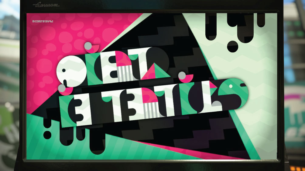
For example, look at the Inkopolis news title screen Below. You’ll see blacks, whites, and neutrals mixed in with bright pastels in a very deliberate way that gives the whole form cohesion. You’ll see triangular background shapes carefully laid out in a way that makes them looked stacked on top of one another rather than just crashing into each other. The blacks in the foremost patterns make the unique shapes stand out and then are reused in the ink drip in the right hand corner to add to the illusion of depth. Lastly, the letterforms take all of the textures and combine them with rounded edges to make them stand out. It’s easy to see the great care used to craft this one image, and that attention to detail carries on through the whole presentation. The Inkopolis News intro screen even uses the same color combination as the Figure It Out set above, but without making them clash.
The Inkopolis News intro screen in Splatoon 2
Despite a far greater success at pulling off these visual patterns, if you saw them while playing Splatoon without having seen the Nickelodeon ones in a while, you might conflate the two, and forget that the Nickelodeon versions were so harsh by comparison. I certainly did. This is because both brands are built off of the same childish, rebellious spirit. Splatoon simply refined it, and our brains are more likely to remember the good parts of our nostalgia instead of the bad.
It’s difficult to find specific information about the design influences of the artists on Splatoon, so I don’t know if these connections were intentional. However, in an interview on Nintendo’s website in 2015, Splatoon’s producer Hisashi Nogami said: “Our idea was that in the game world the ink-splattering turf wars are something kind of cool and rebellious, like skate boarding.” This cool and rebellious skateboard culture flourished in the mid-nineties and had a huge influence on Nickelodeon’s design choices too.
Comparing Background Patterns from Nickelodeon (left) and Splatoon 2 (right)
If Splatoon and Nickelodeon both got their inspiration from the same place, you can see how Splatoon’s designers could have taken those same concepts and redefined them in a modern way. They were appealing to a modern version of the same audience. But they did it without sacrificing a respect for the origins of the style. And throughout this journey looking back at the Nickelodeon shows of my youth, I realized that letting your perceptions of the things that define your youth evolve in your head over time is not necessarily a bad thing. It allows for your memories to respect the past with a personal fondness that will always exceed the original.


